

CLIENT
Red Dirt and Dessert is a brand championing local, sustainable agriculture by connecting consumers with farmers, growers, and food producers in Eastern North Carolina. The client is deeply rooted in promoting farm-to-table culture, aiming to educate the public on the benefits of eating fresh, seasonal ingredients while fostering a strong sense of community.
OVER VIEW
Red Dirt & Dessert is a community-focused brand rooted in promoting local agriculture and farm-to-table living in Eastern North Carolina. As creative director, I led the development of a complete branding system including the logo, posters, and social media content to reflect the brand’s mission of sustainability, education, and community connection.
TRAGET AUDIENCE
Red Dirt and Dessert’s audience includes local families, health-conscious food enthusiasts, and sustainability advocates in Eastern North Carolina. The age range is 25–55 years old, split evenly between males and females. Cater to individuals who value sustainable food practices, community building, and supporting local businesses. Lifestyles centered on healthy living, family, and wellness.
TIME LINE
2 Month
ROLE
Logo Design | Social Media Design | Branding
LOGO DESIGN
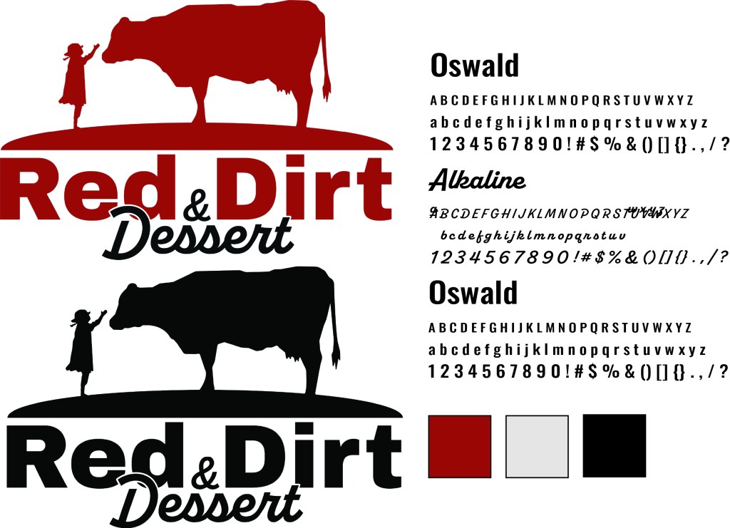
The Red Dirt & Dessert logo was designed to visually represent the brand’s mission of connecting communities with local farmers and sustainable agriculture. The silhouette of a child reaching toward a cow symbolizes the bond between people, land, and food. The curved horizon and grounded typography evoke a sense of place and tradition, while the warm red and earthy tones reflect the natural, farm-fresh values of the brand. The playful yet strong type pairing balances approachability with trust, making the logo instantly recognizable and emotionally resonant for the Eastern North Carolina community.
SOCIAL MEDIA DESIGN
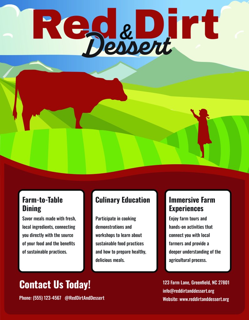
This social media graphic was designed to visually communicate Red Dirt & Dessert’s core offerings in a bold, engaging format. Featuring a stylized rural landscape and the iconic cow-and-child silhouette, the design highlights the brand’s farm-to-table mission while celebrating local agriculture. Clear, easy-to-read text boxes organize key information farm dining, culinary education, and immersive farm experiences making the content both informative and shareable. The color palette and vector illustration style reflect the brand’s earthy, community-rooted identity, creating a cohesive and inviting visual for digital platforms.
SOCIAL MEDIA DESIGN
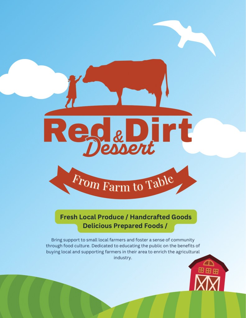
This graphic highlights Red Dirt & Dessert’s farm-to-table mission with a playful illustration and bold, approachable layout. Featuring the brand’s signature cow-and-child silhouette, rolling fields, and a ribbon banner, the design communicates freshness, community, and local pride. Clear messaging and friendly visuals make it ideal for engaging audiences on social media.
POSTER DESIGN
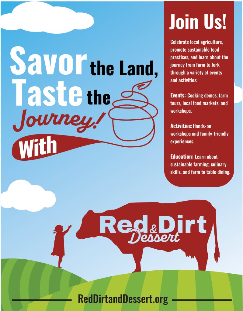
This poster was designed to promote Red Dirt & Dessert’s community-driven message with a playful yet informative visual style. Featuring bold typography, a winding spoon graphic, and the signature cow-and-child silhouette, the layout invites viewers to “Savor the Land, Taste the Journey.” The design effectively highlights key event offerings—education, hands-on activities, and local food experiences—while reinforcing the brand’s mission of sustainable agriculture and farm-to-table living.
Contact
(919) 215-4347
© 2025 AEStudio Designs. All rights reserved.
