

Client Breakdown
Industry: Health & Wellness / Spa Services
Outcome: A cohesive visual identity that reflects the brand’s calming mission, builds trust with diverse clientele, and elevates the overall spa experience.
Target Audience: Traditional spa-goers and individuals with specific medical or therapeutic needs seeking personalized, high-quality treatments in a peaceful, inclusive environment.
Design Direction: Inspired by nature and tranquility, with a focus on creating a grounded yet luxurious aesthetic that invites guests to relax and feel cared for.
Project Scope:
- Brand identity development
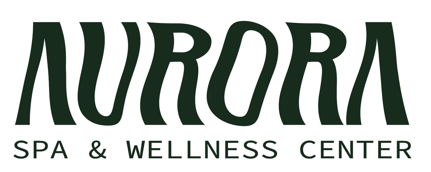
- Logo design
- Product packaging
- Client intake forms
- Interior branding (front desk wall backdrop)
Project Overview

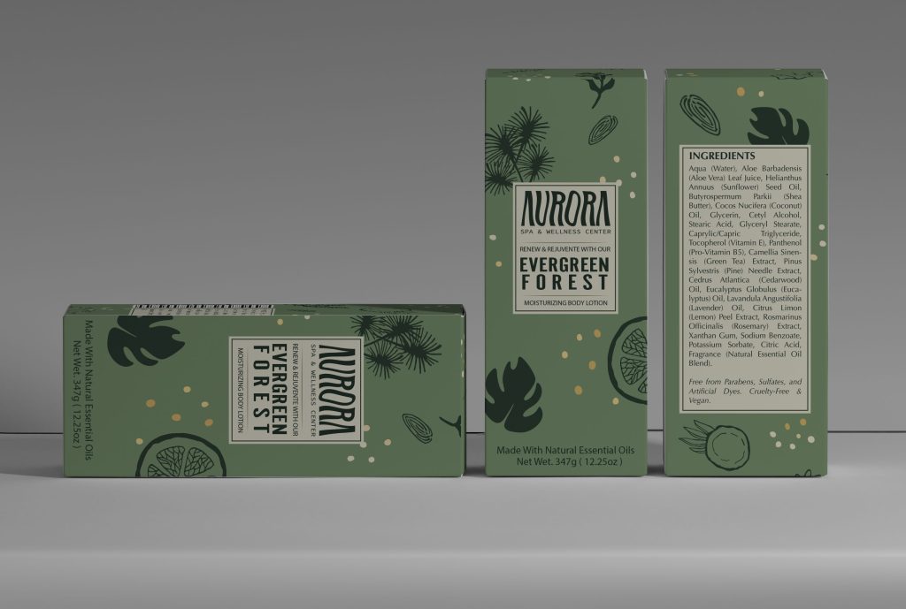
Packaging Design
For this project, I wanted the design to feel calm and connected to nature, so I based it around green plants and soft, earthy colors. The hand-drawn illustrations and clean layout help it feel both relaxing and a little bit upscale, which fits the spa’s brand really well.
One of the hardest parts was coming up with a good product name and ingredient list. I knew what I wanted the design to look like, but finding ingredients that matched the brand’s natural values—and that sounded realistic—took a lot of research. The same goes for the name “Evergreen Forest.” I wanted something that matched the look, scent, and overall feel of the product.
In the end, everything came together into a design that feels peaceful, trustworthy, and inviting. It works well across packaging, branding, and even the spa’s interior, and helps create a consistent, welcoming experience for everyone who visits.

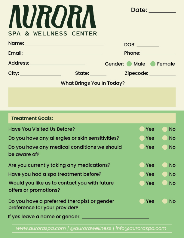
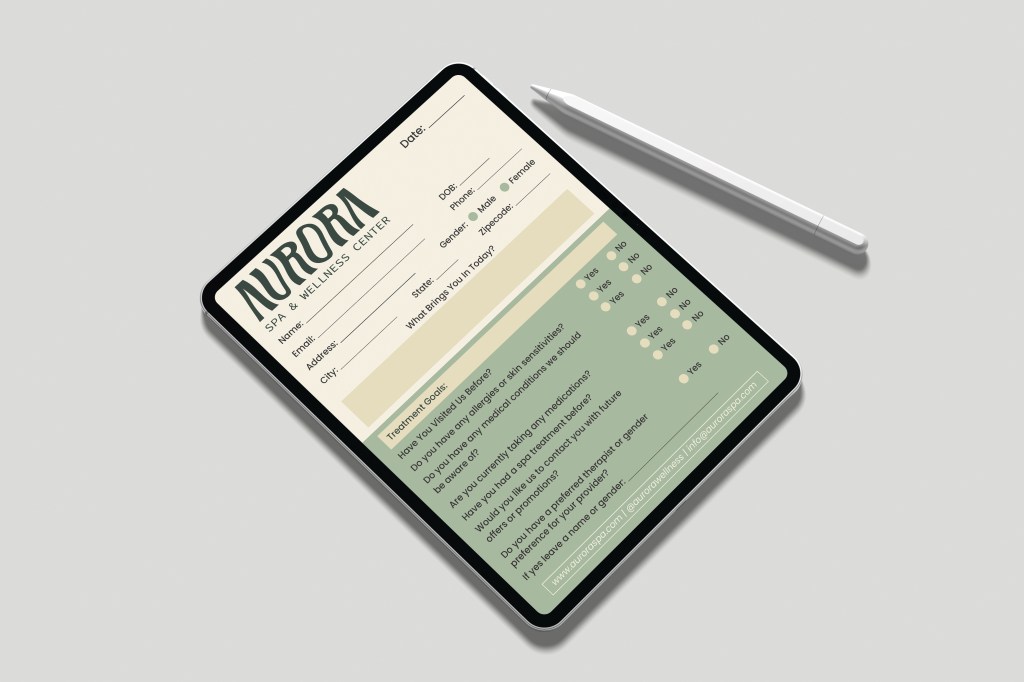
Spa’s Intake Form Design
For this intake form, the goal was to make something that felt clean, welcoming, and easy to fill out—while still reflecting Aurora’s calming and professional brand. I used soft, earthy tones and clear typography to keep it visually consistent with the rest of the brand, while also making sure the form felt approachable to both new and returning clients.
One of the biggest challenges was doing research—most intake forms I found were either too clinical (like at a doctor’s office) or too vague. Since this was for a spa setting that still needed to gather important client information, I had to find the right balance between helpful and personal. Another challenge was fitting all the content into a single page without making it feel cramped. There was a lot of information I wanted to include to improve the client experience, so it really came down to smart layout choices and making the most of the space I had.
In the end, the form is easy to navigate, gives the spa team what they need to provide personalized care, and still feels calm and on-brand.
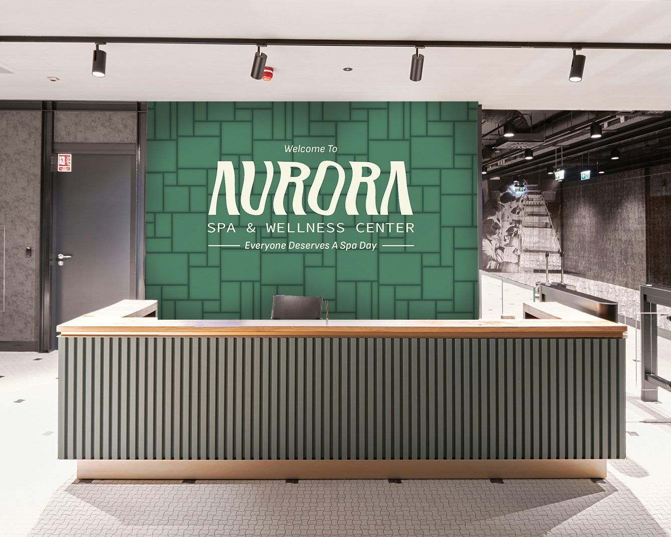
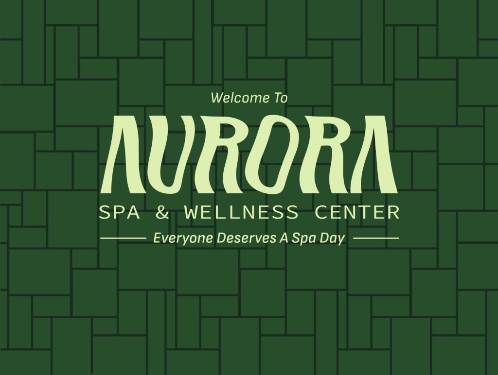
Welcome Desk Backdroup Design
This welcome sign was designed to set the tone the moment guests walk into the spa—calm, warm, and inviting. I drew inspiration from abstract wooden blockboard patterns to create a backdrop that felt structured yet organic. The deep green palette keeps it grounded in nature, while the light typography brings a sense of balance and softness.
A big challenge for this piece was figuring out how to represent the depth and texture you’d see in real wooden blockboards. Since I was working digitally, I used subtle shadowing and layered blocks to give it that dimensional feel without overcomplicating the design.
The overall goal was to keep things simple but elegant—something that reflects Aurora’s brand and makes clients feel welcome without overwhelming the space. The finished design complements the rest of the brand identity and helps create a cohesive, relaxing environment right from the front desk.

